TV : JONO & BEN
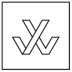
Title Sequence, Motion GFX Packaging and Set Design for Jono & Ben, a satirical news and entertainment show. Jono & Ben ran for 7 award winning seasons and was New Zealand’s highest rated comedy show.
With no limitations on where the project could be taken, I pitched a concept that combined the show’s logo, set and packaging around the same thing - a large neon sign. And a couple of dogs. With the pitch approved, I developed the show’s logo design, title sequence, set design and motion GFX package: bumpers, stings, straps and lower 3rds.
Throughout season 1 I was also the show’s sole motion designer, which involved more motion GFX, 3D & VFX work. Requests often called for me to re-create and parody well known film trailers, title sequences, TV shows & commercials...with ridiculously fast turnarounds.
CLIENT: MediaWorks
CONTENT: Logo / Title Sequence / Motion Packaging / Set Design
ROLE: Director / Art Direction / Motion Design / Logo Design / Set Design
CREDITS
Studio: Jet Black Cartel
Title Sequence Direction & Edit: Karlie Fisher
DOP: Jeremy Toth
Sign Manufacturer: Rollercoaster
Sign Scaffolding: CNC Technology
TITLE SEQUENCE
A SELECTION OF THE MOTION GRAPHICS WORK I CREATED FOR SEASON 1


